architect:
client:
Terms:
project type:
Strategy:
date:
“RED CHICK’N” THE RESTAURANT DESIGN
The project “Red Chick’n” fast food restaurant was located at Jamuna Future Park, Dhaka, Bangladesh. Zero inch interior’s was hired to design an innovating and fresh concept for a new brand of fast food restaurant.
The site was surrounded by other institutional and a few commercial buildings. The location was filled with business potentials for this restaurant, since it was near institutional buildings, like NSU,IUB,and commercial offices like Grameen phone office.
The client wanted something dynamic, that would appeal to the younger generation more since that is the group of people who is more prone to indulge in out-side food. However, he also wanted to target the middle-aged group to some extent so that they could serve for business meetings, or office lunch breaks.
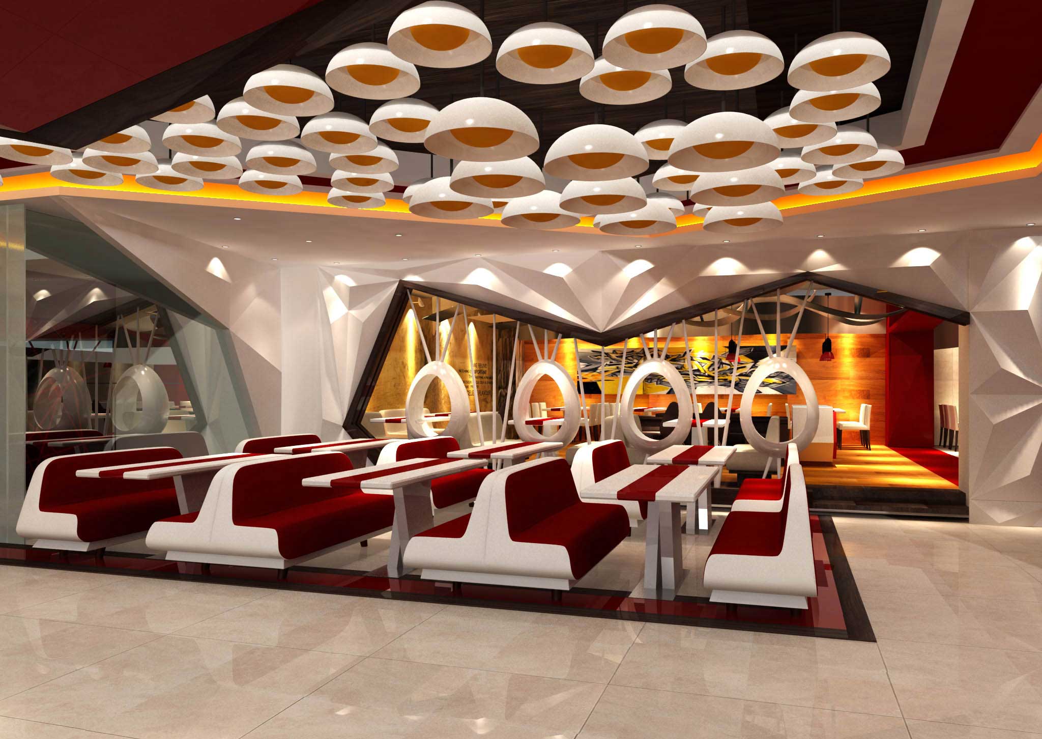
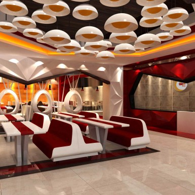
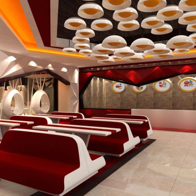
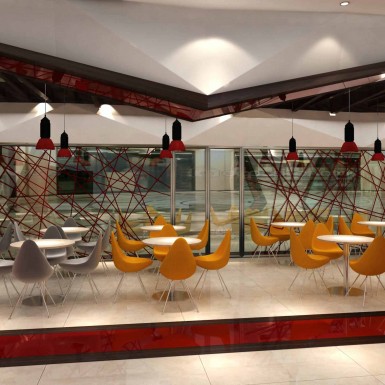
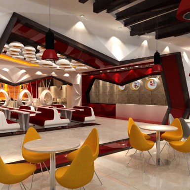
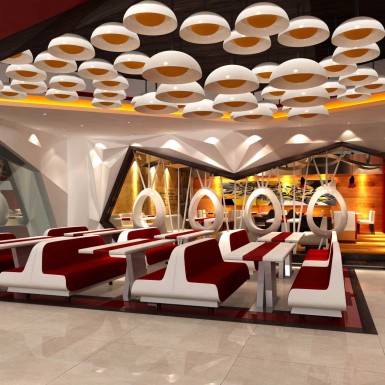
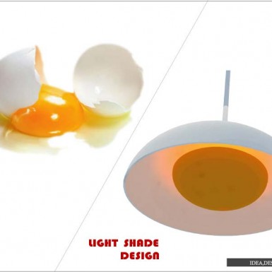
The inspiration came from the name of the restaurant itself. Since the name was Red Chick’n, we used a color palette of red, merging it with white to create a sharp contrast. and The idea of using the oval shape of chicken egg or the shape and color combination of poached egg within the different forms, used in the interior, greatly appealed to us. So a color palette of white & yellow was also introduced into the project at a certain stage.
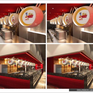
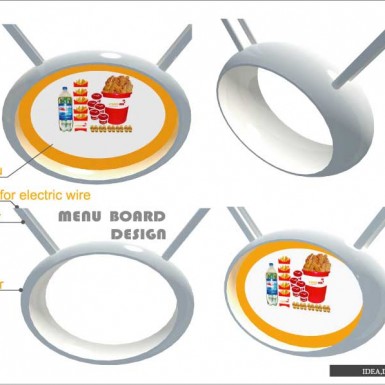
Our goal was to take a revolutionary approach in setting a new unique trend for the brand of fast food restaurant design. We also worked on coming up with a unique name for this brand of fast food. The name Red Chick’n has been thought of by us we we also worked on its logo design. We decided to design innovative and unique menu board for this restaurant. Overall, we worked on creating a whole new unique brand identity for this project.
We started by sketching the possible conceptual ideas for this project. At first, we tried to figure out the out-look of the interiors on a conceptual level before going into the planning details. Nextly, we sat with the schematic planning. We basically divided the dining space into two parts- one was an informal sitting area for mostly group of youngsters & the other was a little formal dining area for lunch meetings of offices or more private dining arrangements. The flooring of the informal sitting area was done with simple white tiles but the more private sitting area had a flooring done with processed wood and the platform was also raised to some extent to create a separate space. The partition to separate the two dining spaces was done using our concept derived from the shape or form of eggs.
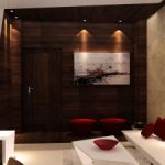
Polished veneer board was used at the back-drop of the more private seating area to create an ambiance of glowing within.The counter was also custom-designed and custom made to go with the flow of our concept. Soft and warm textures allow the occupant to relax & enhance the sense of luxury, where as the sense of symmetry through-out the lay-out adds a flavor of formality. Since the design was solidified with great finishing, it shines out and takes its own stand. The hanging lights within the ceilings were also considered by us. We derived the color combo and the form of the hanging lights from the idea of a poached egg.
At the end of every project, our main satisfaction comes from whether the clients’ requirements have been met or not or whether the client is happy with our methodology & design process
From site visiting to designing to construction, we handle everything, from scratch to the finish. We make working with the details fun and accurate. We are known for our timely accumulation of the whole project, with in a specific time-frame.
